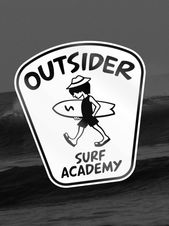
Supertubos Surfshop • Branding
Visual identity for a surf shop rooted in local culture and pure wave obsession.
The Need
The client needed a bold and memorable identity that could stand out in a saturated surf market, while staying true to its early '00s roots and core surf culture. The goal was to create a visual system that felt raw, energetic and authentic.
The client needed a bold and memorable identity that could stand out in a saturated surf market, while staying true to its early '00s roots and core surf culture. The goal was to create a visual system that felt raw, energetic and authentic.
The Solution
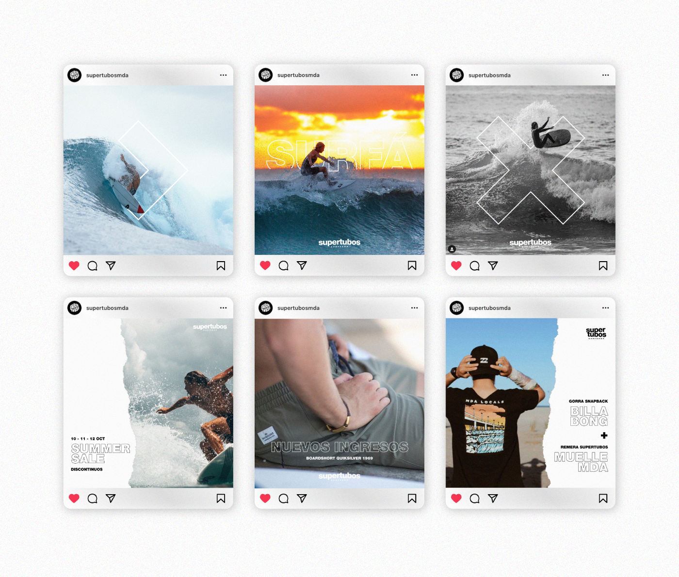
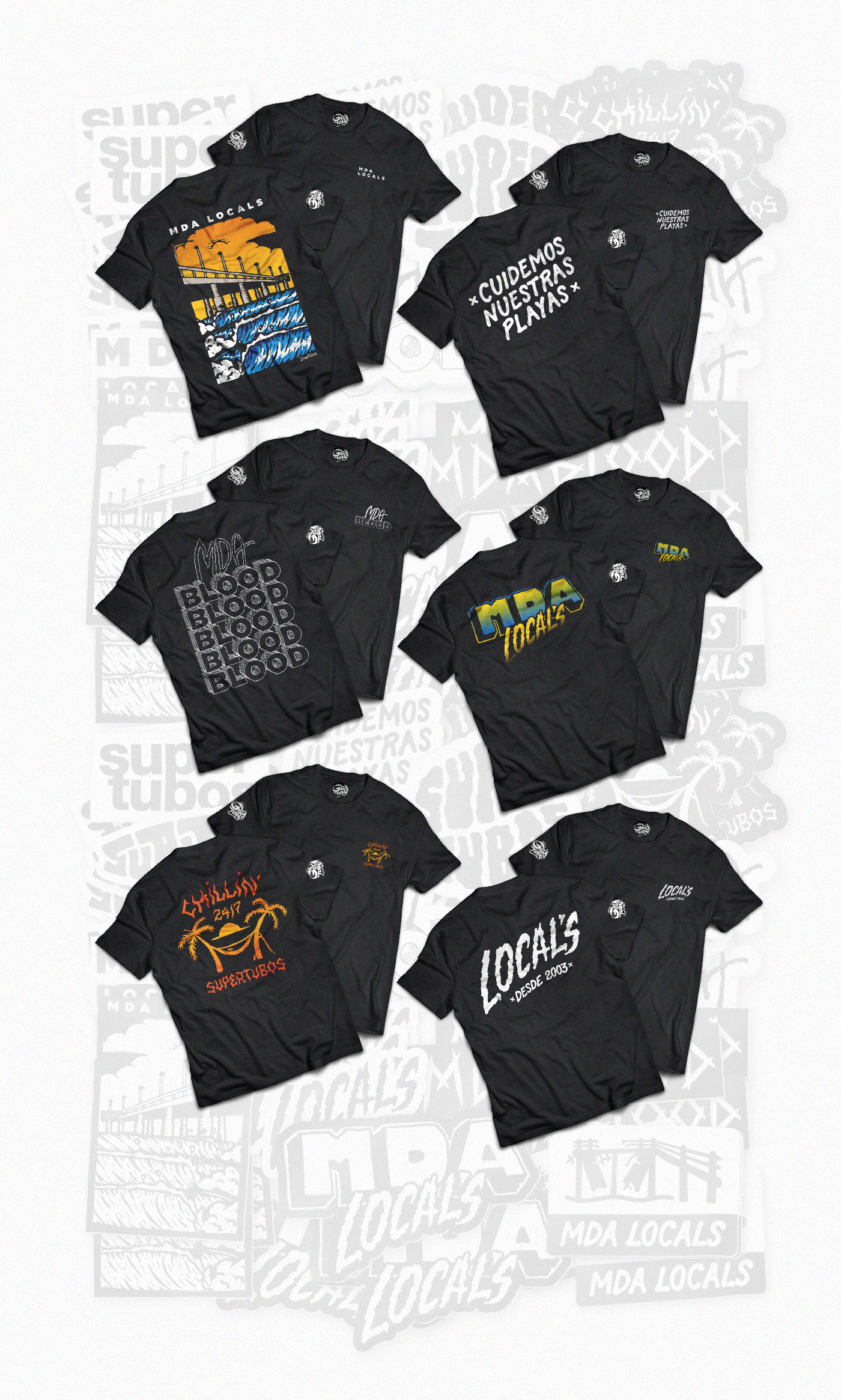
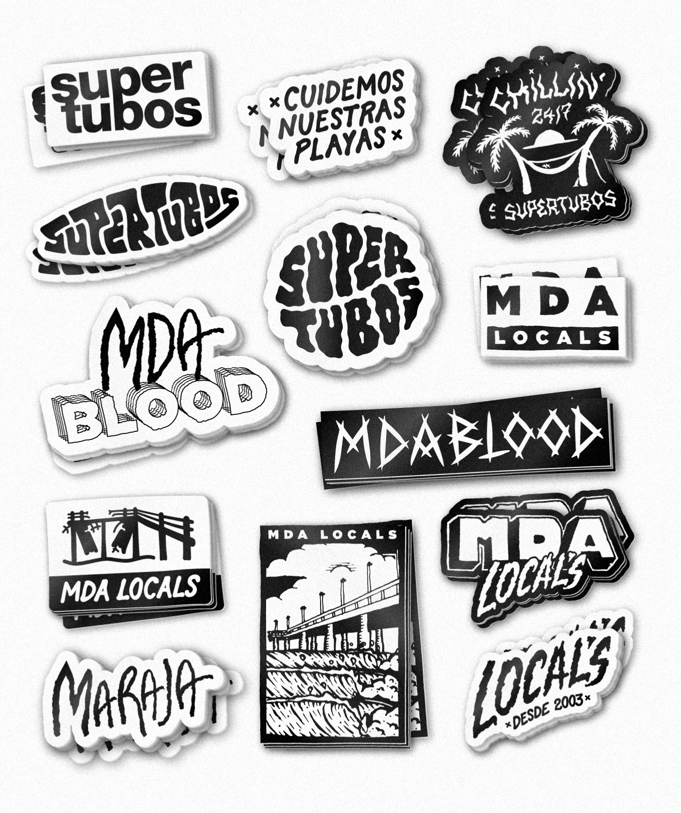
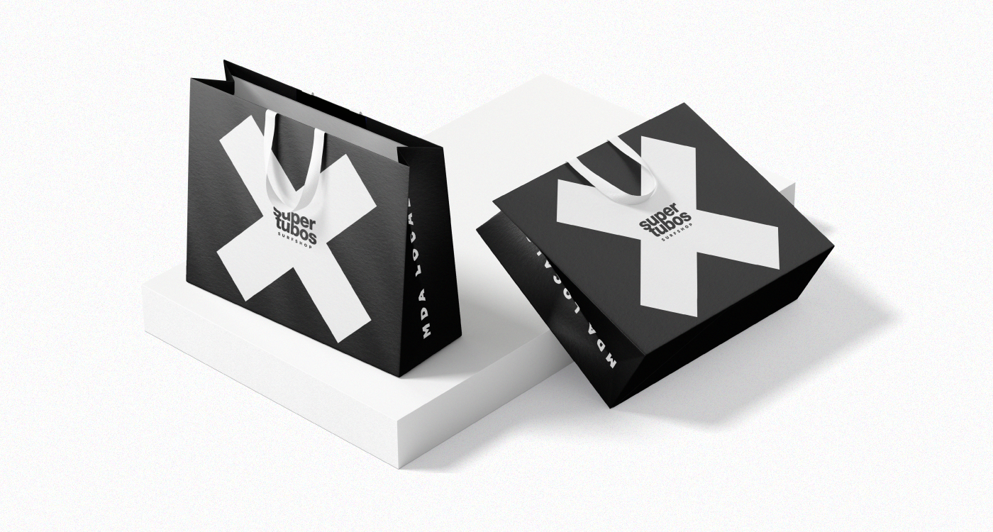
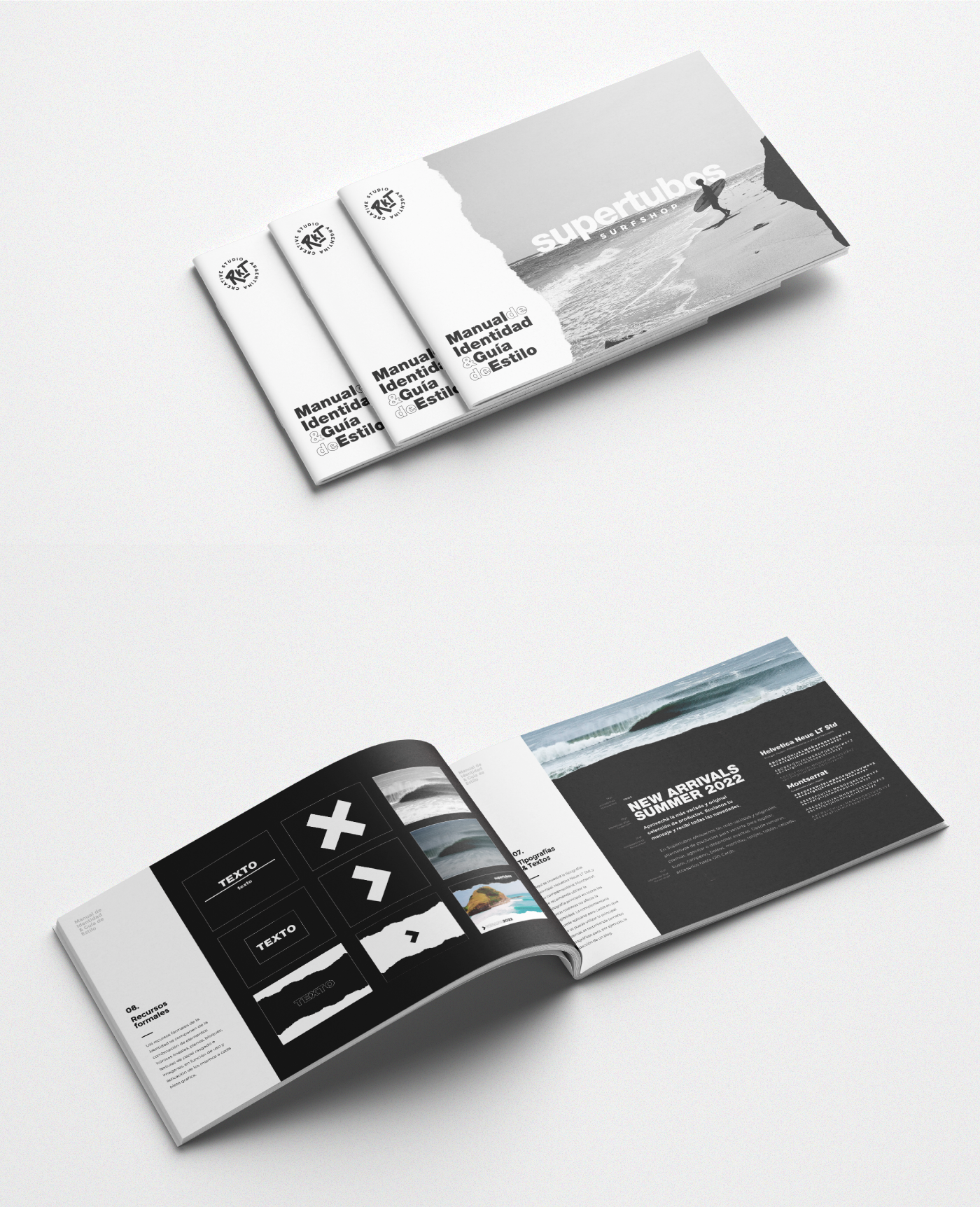
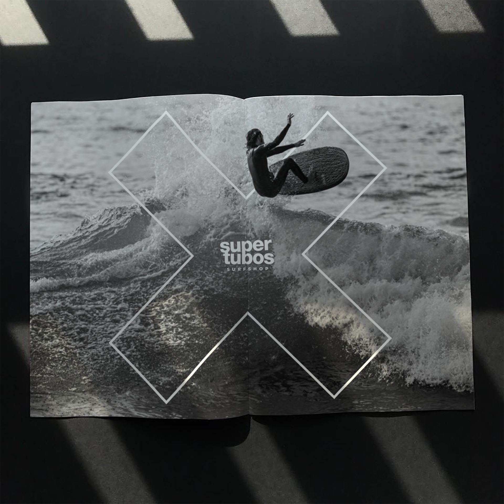
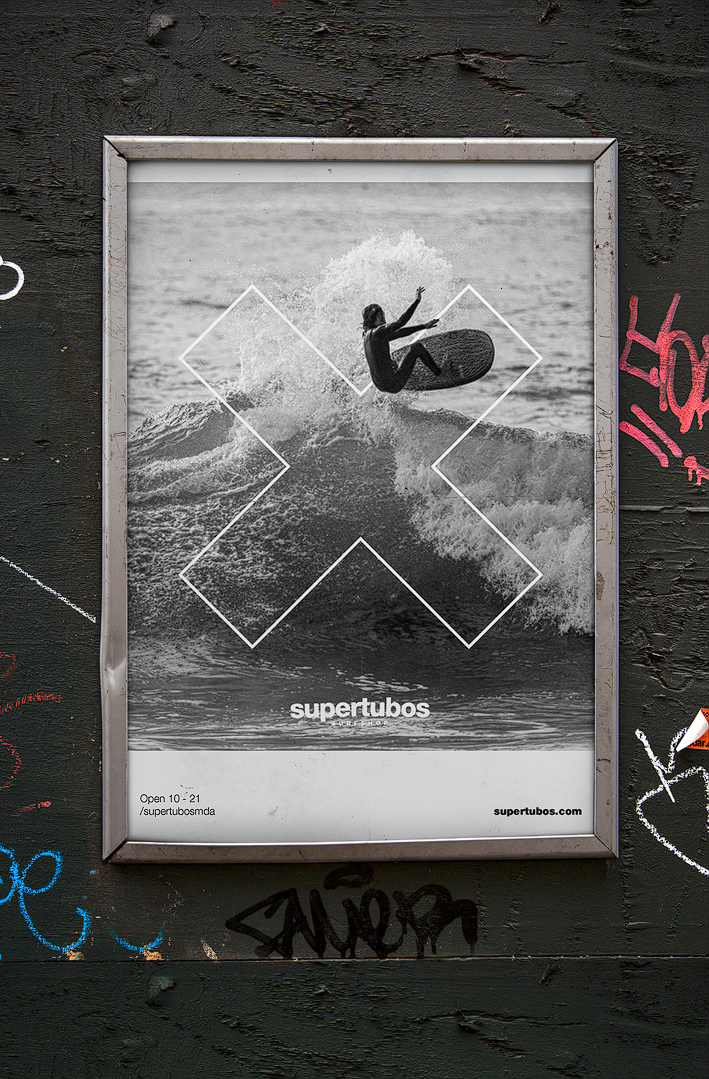
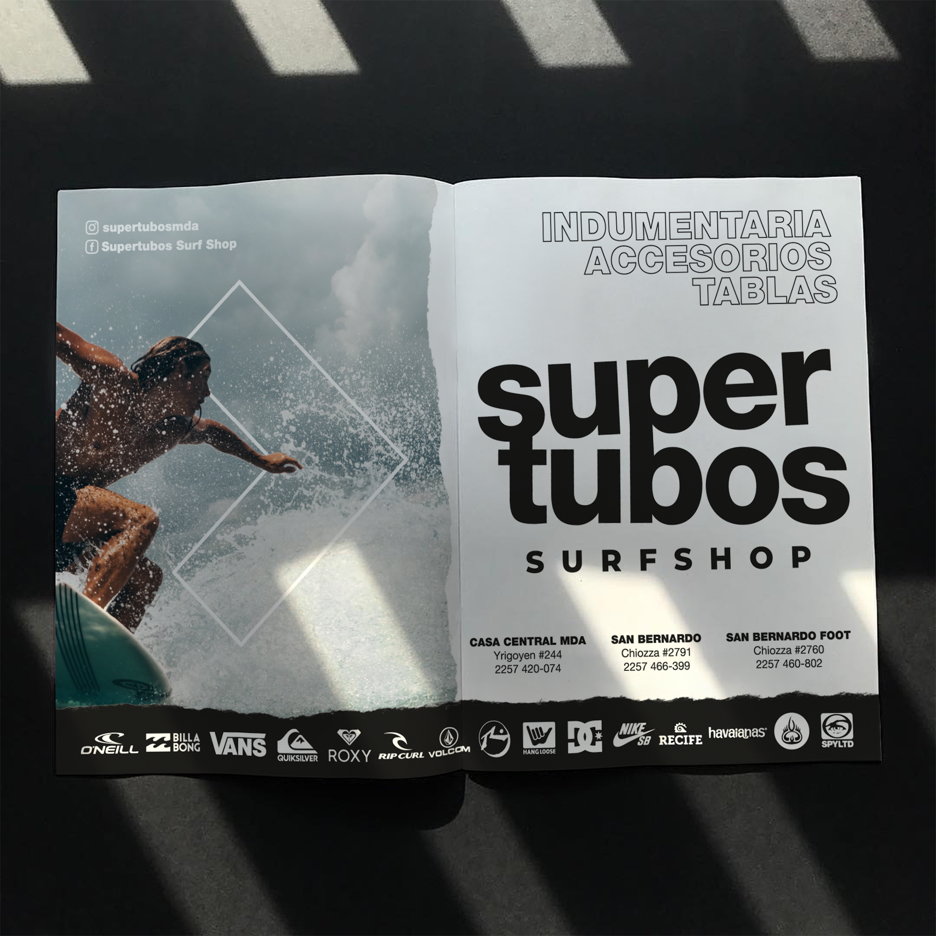
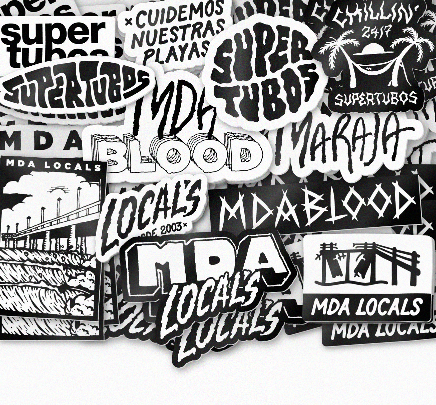
We created a heavy, typographic wordmark inspired by the power of stormy breach-breaks, paired with hand-drawn textures and illustrations that reflect the local surf spirit. The identity was designed to feel accessible, loud and true — living across print, merch and the physical space.
We created a heavy, typographic wordmark inspired by the power of stormy breach-breaks, paired with hand-drawn textures and illustrations that reflect the local surf spirit. The identity was designed to feel accessible, loud and true — living across print, merch and the physical space.
Our Role
Brand identity, art direction, typography, illustration, signage, print design.
Brand identity, art direction, typography, illustration, signage, print design.